# Date the work was done
May 2022
# Co-design research
This was the first time we had put our ideas in front of users.
In this remote session, we wanted to understand how users felt about the screens in the click-through and what changes they would make.
For this session we had three delivery officers from the Operational Delivery Team. The co-design session was divided into 3 activities.
# Activity 1: Initial thoughts
- The first activity included a run through of the click-through prototype.
- Participants were then asked to comment on things they liked, concerns they had and note any questions.
# Activity 2: Project list – make it better
- The second activity concentrated just on the project list page.
- We asked users to write comments on just one thing they liked, one thing they would remove, and one thing that would make it better.
# Activity 3: Your ideal task list
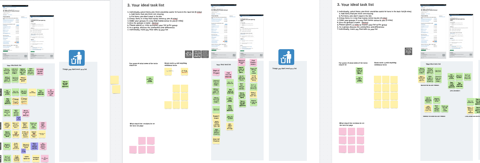
The final activity was a card sort exercise to try and get our participants to think about what should be on the task list.
This helped us understand what was required so we can add the correct level of detail to tasks.
We gave users a set of predefined items on our current project task list. We also gave them a virtual bin to throw items that were not necessary and the ability to add new tasks.
Participants were then asked to sort, group and name each of the groups of tasks.
# What we learnt
The co-design session showed us that there were some changes to make, but that the fundamental idea made sense to users.
We also made some discoveries that will help inform design decisions.
# Things we learnt about the projects list
- Delivery officers can work on 15 to 20 projects at once
- There are 2 baseline dates
- Delivery officers only use current URN and school name to refer to a school, new name or URN for academy is not use
- Participants want to order projects by completion date
- They want to clarify visual grouping of projects in each calendar month
- Add both baseline dates
- Add information about project and school to each project
- There are projects with multiple schools joining the same trust
# Things we learnt about the task list
The co-design also taught us that the basic idea at the heart of our design ‘the tasl list’ was right for users.
We learnt from the session that:
- All participants used the majority of our predefined cards in their lists
- All participants agreed it was useful to have more in-depth level of details in the task list as jobs might be missed. It would be helpful to train and guide new starters. This should contain both data they are required to collect and process tasks they just need to remember to do
- All participants agreed that there are two clear groups of tasks that need to happen at the start and at the end of a project, but the task in between can happen more freely
- All participants ordered their lists chronologically (what happens at start, middle and end of project)
Labels used for groups seems to be a mix of chronological terms, like “start of project” or “post-conversion actions,” and descriptive terms like “Clearing of legal documents” - It seems like 4 to 6 groups of tasks in the lists will be about right

# Things we learnt about the detailed check list and task screens
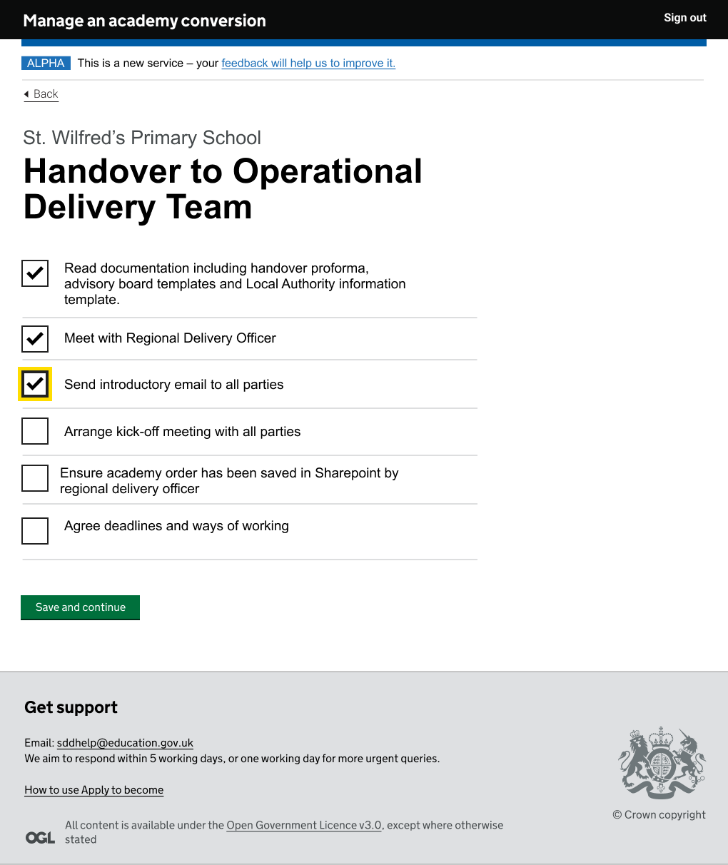
We also learnt some useful things about the check list, including:
- Fields on these screens will vary depending on type of project and task. Participants pointed out flexibility is needed here, such as the ability to add notes where a tick box might not give enough information
- There is a desire to be able to remove tasks if not needed

# Changes made to click-though
As a result of what we learnt, we made some changes to the Figma click-through prototype:
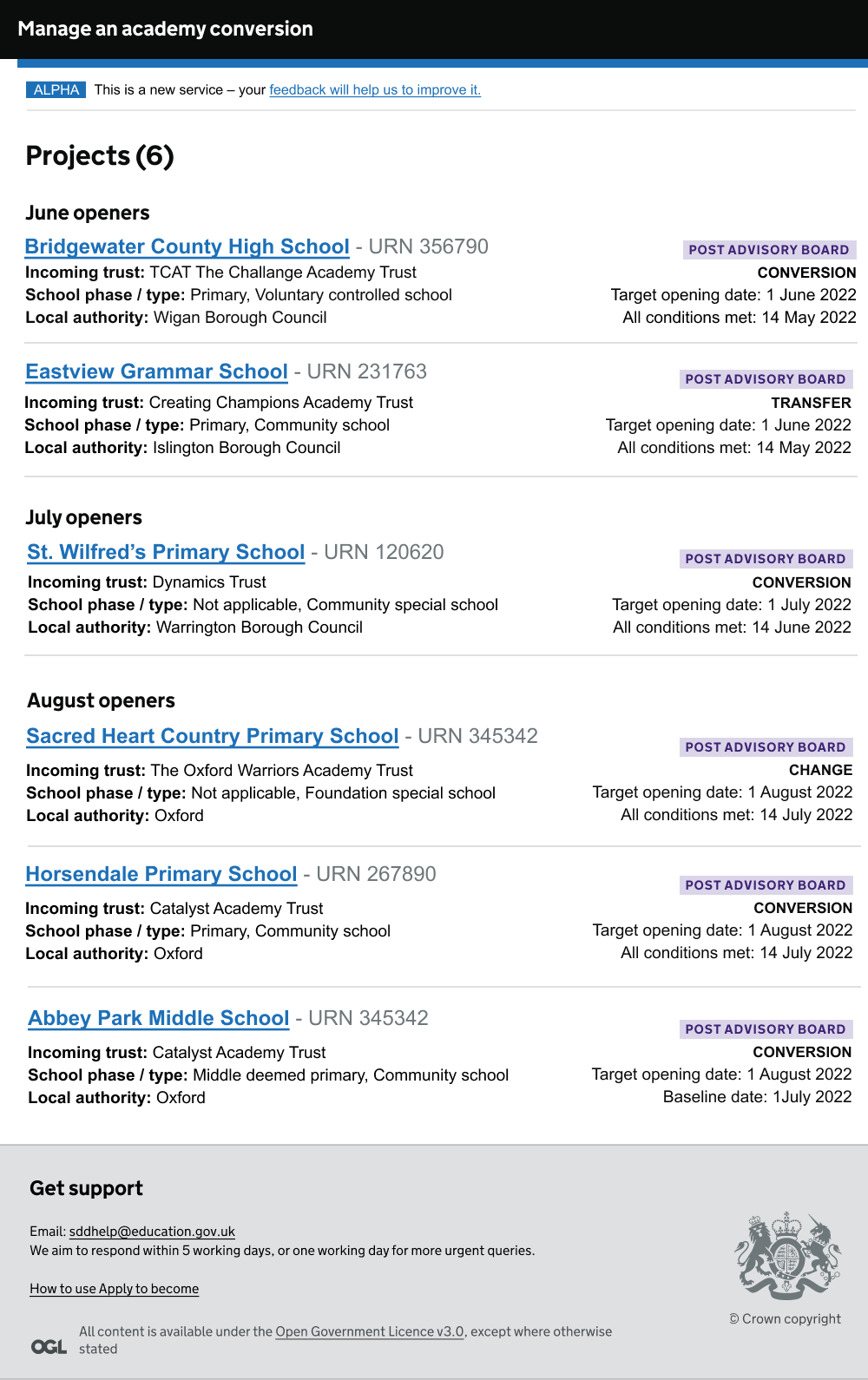
- Added type of school, class of school, type of project and all conditions met baseline date to project list page
- The projects list has been split into more obvious sections for schools opening within the same month
- New URN has been removed
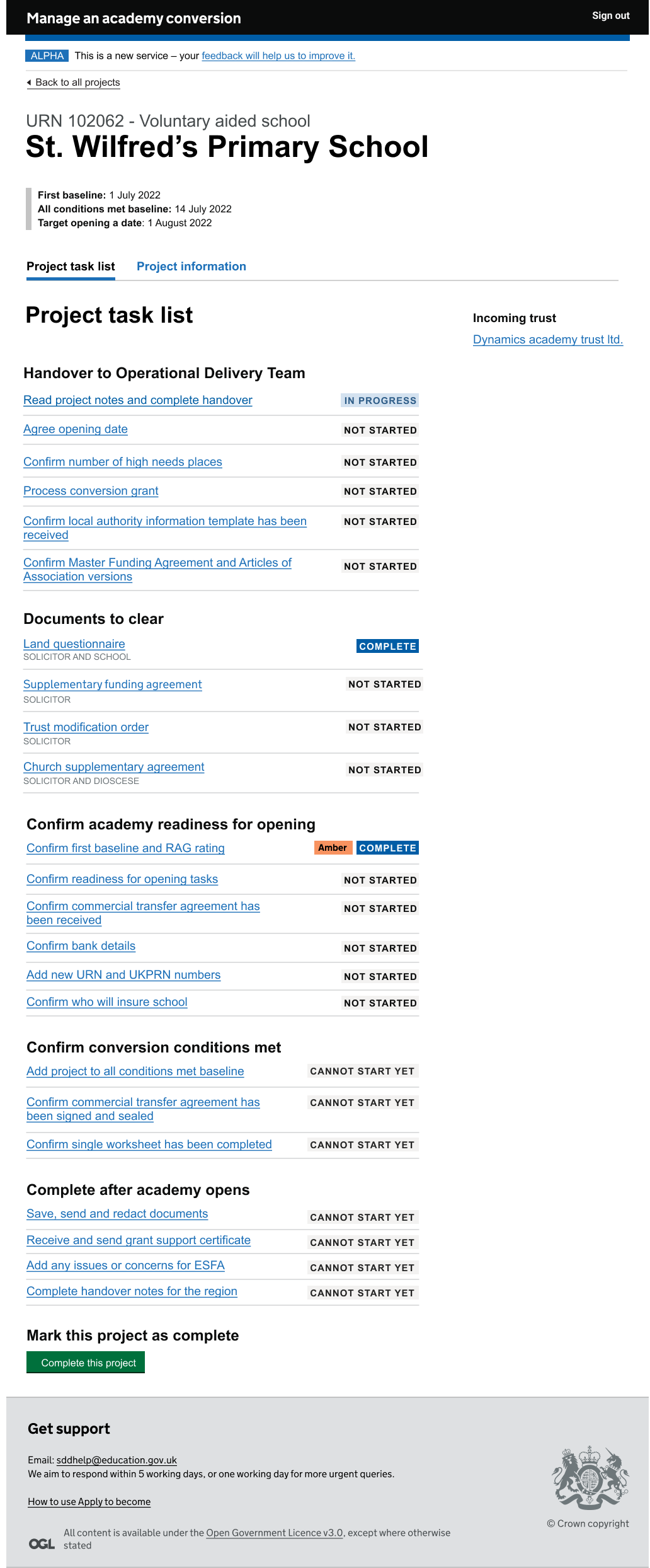
- Redesigned and relabelled the task list, trying to merge and use participants’ ordering and grouping as much as possible
- The task list now includes a second baseline date and an additional group for final checks
- Ability to add more than one set of solicitor contact details have been added to the project information page
- Both baseline dates have been added to the top of the task list section to emphasise them
# Screenshots


